This image shows our artist name and our album name in different fonts. These are clear simple fonts that are normally used on albums of the same genre. I want the font i choose for my digipak and magazine ad to be easy to read.
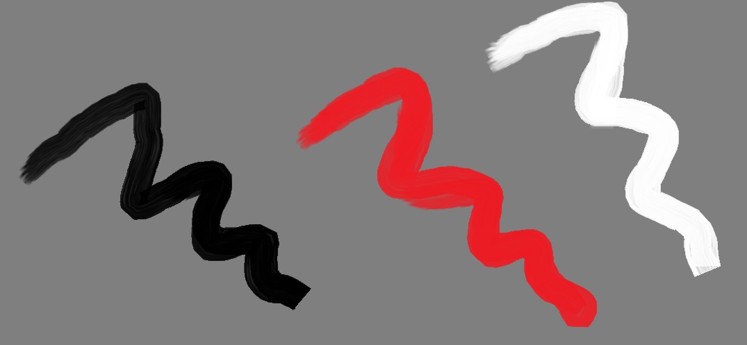
This image on he right indicates the colours that i am looking to use. I have stuck with 3 colours which are black, white and red. I stuck with black and white because they are used often within our genre and i included red because i think that it will brighten things up and stop it from looking to plain.

No comments:
Post a Comment