
Showing posts with label Hafiza Mussammad. Show all posts
Showing posts with label Hafiza Mussammad. Show all posts
Friday, 1 February 2013
Blogging complete
I have finally finished blogging, it was a great experience and i have learnt many new things. Thank you to all the teachers for all your help especially Micky and Trevor they've been great.

Final progress review blog
My A2 blog compared to my AS blog has an extreme amount of detail and is a lot more visual. I used many more different forms of ICT such as slide shows. My blog goes through all my research, planning and production stages of both creating a music video and ancillary work. I feel that my blogs show the stages clearly and effectively as i have clearly stated what i did. I have about 100 individual blog posts which i tried to make as interesting as possible. I would change my filming blogs as they don't reflect on everything we did. I would of also liked to have recorded the screen whilst editing the music video.
Tuesday, 29 January 2013
Evaluation Question 4
Evaluation - What have you learned from your audience feedback?
On the way to the cinema i was very nervous about watching my music video on the big screen. I traveled with Ipek and was talking to other group members whilst on my journey and it seemed a lot of people were feeling the same way.
One of the main reasons for feeling nervous is the fact that another group was doing the same song as us which meant both music video's will always be compared with each other. However, i was really excited to see the music video especially on a big cinema screen and to just get everyone's overall view and what they thought.

After everyone had finished their music video's we had the opportunity to watch them in cinema. This was a great way to see how the audience would react after seeing the music video. Below is a video which shows some of the feedback we got after viewing it in the cinema.
We were given back a lot of positive feedback which made me feel proud of the music video. We also got back some helpful constructive criticism which was interesting coming from different people.
Some of the things that people liked about the music video was the projected footage we used. The also like the use of location such as the nigh shots we did in Kings Cross especially because of the colorful water fountains. Many people asked where this location was as they now wish to go visit it. Another great positive feedback we got was the editing of the music video as people mentions it went well with the beat of the song. I think this is one of the hings that i am most proud of as i spent time putting in quick cuts when the beat got faster or adding a transition such as a fade when the beast got slower and went into the chorus.
From both a female and male audience said that they thought our artists did a very good job and suited the role well. They said he looked good and was very enthusiastic which i can agree with as i filmed some of he shots.
Some of the constructive criticism that we got back was to include a more variety of shots. I think that a good way o improve the video is to include more camera movements as the camera was still for most of the shots.
From the feedback i have learnt that i should be happy the final video as people said that the editing was really good and went well with the beat of the song. It's also important to to include a wide range of different shots of our artist which i think we could have got more of like and extreme close up. Plus to keep the music video interesting movement of the camera goes well so it is best not to use a tri-pod when filming. The locations used make a great difference within a music video and i think that the ones we chose went well with our story.
Evaluation - Question 3
Evaluation - How did you use media technologies in the construction and research, planning and evaluation stages?
Using Photoshop
Using Final Cut Pro
Using Photoshop
Using Final Cut Pro
Monday, 28 January 2013

Evaluation - Question 2
How effective is the combination of your main product and ancillary text?
I feel that there is a clear link between both my ancillary work and my music video as the theme i went for on my ancillary work had a space theme which we see clearly in the music video.
Also as well, the images i chose to use of the artist are similar to the style of shots we used in our music video. The identity i have created in Montell hasn't changed within the ancillary products to the music video.
Also as well, the images i chose to use of the artist are similar to the style of shots we used in our music video. The identity i have created in Montell hasn't changed within the ancillary products to the music video.
Some of the shots used in our music video involved our artist with a projection with the space theme. This shot is used repeatedly in the chorus therefore, the audience can make a clear link from between the space theme used on the cover with the space footage used in the music video.
Moreover, the inside panel of my digipak has a quote "Is you're looking for the stars keep looking at me hard." This is a line taken from the chorus of the song so the audience will also be able to make the link because the song 'Wonderful' is the first single our artist Montell has released.
The images that i decided to use also followed the star image we were going for in our music video. We didn't want to make our artist get mistaken for a rapper or have stereotypical rapper look. Instead we kept him looking quite simple and almost vulnerable through the music video and also within the images i used on my ancillary work.
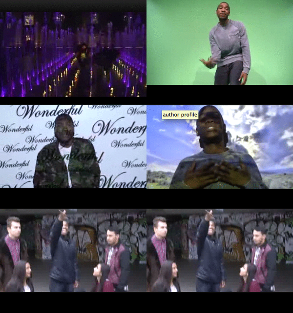 |
| Images from music video |
In the video's above i asked two questions which were, 1)Do you see a link between the music video and the ancillary work? and 2)Would you buy the album if you saw it? I asked both a female and male audience aged 17-18 so i was able to get feedback from my primary (females) and secondary (males) audience.
One of the main links that everyone saw was the background i used for my ancillary work. The space theme was a clear link as we had footages of our artist with a space background on a few of our projected parts of the music video. Another clear link was the artist himself and using an image of him on the ancillary work, this makes it easier for the audience to recognise who the album belongs to and for the magazine advertisement who it is that is being advertised. Moreover, i got feedback about how the ancillary work is linked to my genre and fits in well, this made it more attractive tot he audience.
From all my feedback i got a positive reaction on whether the audience would be attracted with my ancillary work. One of these was the images of artist as people thought they looked really good. Another thing was that the background and chosen colours make it stand out so will catch the
audiences reation. They also said that it looked good because of the layout chosen making it look very presentable.
Sunday, 27 January 2013
Evaluation - Question 1
In what ways does your media product use, develop or challenge forms and conventions of real media products?
Digipaks are created to help advertise and promote a music genre. It is also a hard copy form that a fan can buy and have feeling more connected with the artist. For my ancillary work i researched on similar artists with a similar genre to mine. One of the digipak's that i analysed and influenced me was Tinie Tempah's 'Disc-Overy'. This followed a similar theme and look i was going for which was the space background.

The layout of my album cover was influenced by Tinchy Stryder's 'Star In The Hood' album cover. This consisted of a close up shot of the artist in the center with the artists name and album name in the bottom center I also used a clear font making it easy to read and kept the artists name bigger than the album name meeting similar conventions to my genre.

Magazine advertisements are to help sell albums created by an artist. I researched similar artists magazine advertisements to mine that also had a similar genre. With this i felt my magazine advertisement fit in with the conventions other advertisements follow. By researching i realised that many of these advertisements used one image that was the album cover however i did not want to this as felt i would have been to repetitive. Plan B's magazine advertisement gave me a good idea on the information i should include however i felt there was a lot of empty spaces so i decided to do mine in A5.

Digipaks are created to help advertise and promote a music genre. It is also a hard copy form that a fan can buy and have feeling more connected with the artist. For my ancillary work i researched on similar artists with a similar genre to mine. One of the digipak's that i analysed and influenced me was Tinie Tempah's 'Disc-Overy'. This followed a similar theme and look i was going for which was the space background.

The layout of my album cover was influenced by Tinchy Stryder's 'Star In The Hood' album cover. This consisted of a close up shot of the artist in the center with the artists name and album name in the bottom center I also used a clear font making it easy to read and kept the artists name bigger than the album name meeting similar conventions to my genre.

Magazine advertisements are to help sell albums created by an artist. I researched similar artists magazine advertisements to mine that also had a similar genre. With this i felt my magazine advertisement fit in with the conventions other advertisements follow. By researching i realised that many of these advertisements used one image that was the album cover however i did not want to this as felt i would have been to repetitive. Plan B's magazine advertisement gave me a good idea on the information i should include however i felt there was a lot of empty spaces so i decided to do mine in A5.


Friday, 25 January 2013


Friday, 18 January 2013
Tuesday, 15 January 2013
Production - Inside album cover
inside album - slideshows
I wanted the inside of my digipak to go with the front and back cover so i kept the space background but only used a bit of it. I used the same template i used for the front and back but i also added a template of where the CD would go.
To get the CD image i just places the image of the stars background behind the CD template layout. To outline the CD the template i out on the glow tool which it gives it the white outline effect, i felt the shape had to be more emphasized and thought it went well. I also used a side image of the artist because i wanted it to be a different angle to the front cover image and the image i am going to use for my magazine advertisement. I thought the side shot went really well because he is looking straight at the CD.
Wednesday, 9 January 2013
Planning - Change of name
Whilst i was beginning to create my digipak on photoshop i felt that the name 'Supernova' was too long and looked bigger than my artists name. Therefore, after feeding back to my group we all agreed to change it to Nova as we felt this sounded better and looked better for our ancillary work. Also, we felt that the name Nova is more suitable for our target audience as it is short and catchy. It isnt a word that you would necessarily hear teeangers use or some may not have heard before but we thought it sounded interesting and would make our audinece feel more intrigued.
We also wanted to keep the name linked with our space theme that we thought went really well which will give our digipak and magazine a clear link for our audience to see that there is a clear connection between the two. This would also help an artist to sell an album as the audience would have heard a single or two which in Montell's case would be 'Wonderful' so if someone really liked the song they'll be able to like the connection with the album and go out to buy it or download it from iTunes.
We also wanted to keep the name linked with our space theme that we thought went really well which will give our digipak and magazine a clear link for our audience to see that there is a clear connection between the two. This would also help an artist to sell an album as the audience would have heard a single or two which in Montell's case would be 'Wonderful' so if someone really liked the song they'll be able to like the connection with the album and go out to buy it or download it from iTunes.
Planning - themes and design ideas


Planning - fonts and colour ideas

Tuesday, 8 January 2013
Planning - Mock up of adevertisement
These are 2 magazine advertisement mock up's that i have created from doing my research. The firs one is an A5 advertisement and the second one is A4.

Above is an image of the A5 advertisement i created. As you can see i will be including an image of he artist on the left hand side of the advertisement. At the top i want to have the artist name as the same font i used on the album. This is then followed by the name of the album which will be in a smaller font and in the same font and colour i used on the album cover. Some of the text i plan to use on the advertisement are things like "Includes the smashing hit 'Wonderful'". I also plan to include the release date, album cover and artists website.

Above is an image of the A4 advertisement i created. This one has a mid shot of the artist on the right. It also includes the artists and album name at he top of the advertisement. Compared to the A5 advertisement this one include more information like ratings from magazines. It also includes a picture of the album cover, release date and artists web site.


Sunday, 6 January 2013
Planning - Picking the album name
As a group we decided to have the album name related to space. We then searched on Google words related to space. We got a list full of different words so we had a wide range to chose from.
A few of the suggestions were

A few of the suggestions were
- meteor
- supernova
- eclipse
- Axis
- Asteroid
In the end we agreed to call it Supernova as we felt it would be appealing to our target audience and also go with our music video.

Subscribe to:
Posts (Atom)